How to Develop a Machine Learning Trading Bot - Part 2: Data Analysis
Bahman
Published on Dec 12, 2021
Previously on "How to develop":
If you want to maximize the performance of developing and coding, please read "How to design a machine learning trading bot – Part 2: Data Analysis" before proceeding.
Next, let's look at the development.
Data analysis is a key component of machine learning. When combined with numeric finance market data, it becomes even more significant. The articles in this series are designed as educational material, simplifying complex problems. This study uses basic data to demonstrate how it can be analyzed. Ultimately, we explore how to improve trading via machine learning in this series of articles.
Data Analysis:
The previous article discussed collecting OHLCV stream data and using historical data to train a model, then applying stream data for real-time predictions.

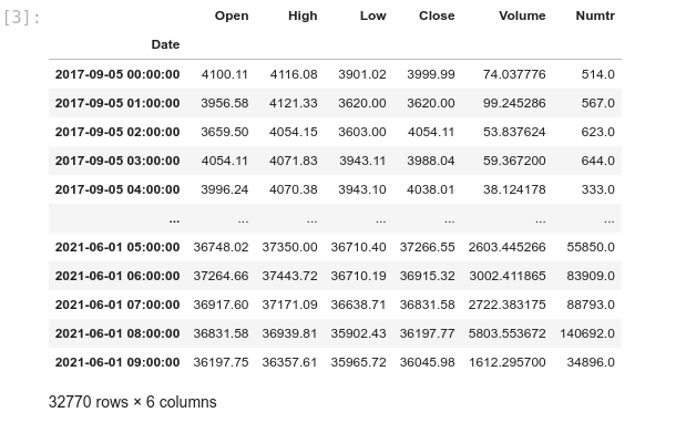
At this step, we need the historical data from the following CSV: 1H.csv. It contains Binance 1 hour OHLCV from 2017-09-05 to 2021-06-01.
We will explore the code in JupyterLab, which provides a rich environment for education and research:
crypto_data_analysis — analysis.ipynb
Block [1-3] – Inspect the CSV data. We reformat the date column to DateTime and set it as the index.
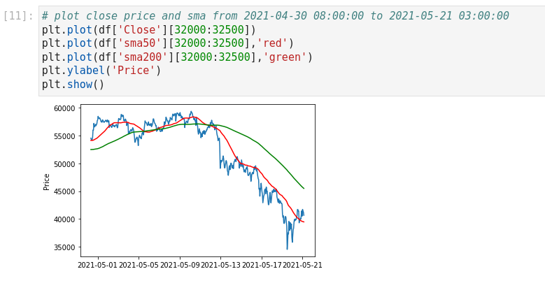
Block [4-6] – Plot close prices. First, the full timeframe; then zoom into 2021-04-30 08:00:00 to 2021-05-21 03:00:00 for detail. Visualization helps understanding.
Don't be afraid to visualize your data. It will help you in your analysis. Here are the two most useful Python libraries we will use:
Matplotlib: https://matplotlib.org
Seaborn: https://seaborn.pydata.org
Block [7-8] – Ensure data cleaning. Check for nulls in the Close column and correct as needed before proceeding.
Block [9-11] – Add moving averages (SMA9, SMA20, SMA50, SMA200) to the DataFrame and plot SMA50 & SMA200 overlays.
Features vs. Labels
Two main keywords in data analysis:
- Feature
- Label
In the next article, we’ll dive deeper into labels. This section focuses on features. From Google’s ML Crash Course:
A feature is an input variable—the x variable in simple linear regression. A simple ML project might use one feature; a sophisticated one could use millions.
Imagine predicting car prices:
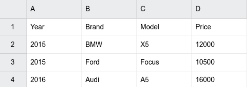
Price is our label, while Year, Model, and Brand are features.
Back to our data: we need to decide if existing columns suffice or if we must engineer new features. Close price alone isn’t a stable feature; normalization still ties it to absolute value.

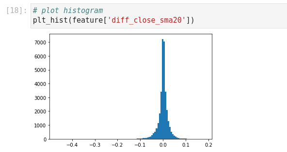
Block [12-13] – Histogram of Close shows a non-normal distribution. A good feature should approximate normality.

Block [14-20] – Engineer diff_close_sma20 = (Close – SMA20) / Close to normalize variance to approximately ±0.1. The histogram now resembles normal.
Block [21-24] – Plot correlation heatmap to identify and avoid highly correlated features. Example: diff_close_sma20 and diff_close_sma200 behave similarly, so choose one.
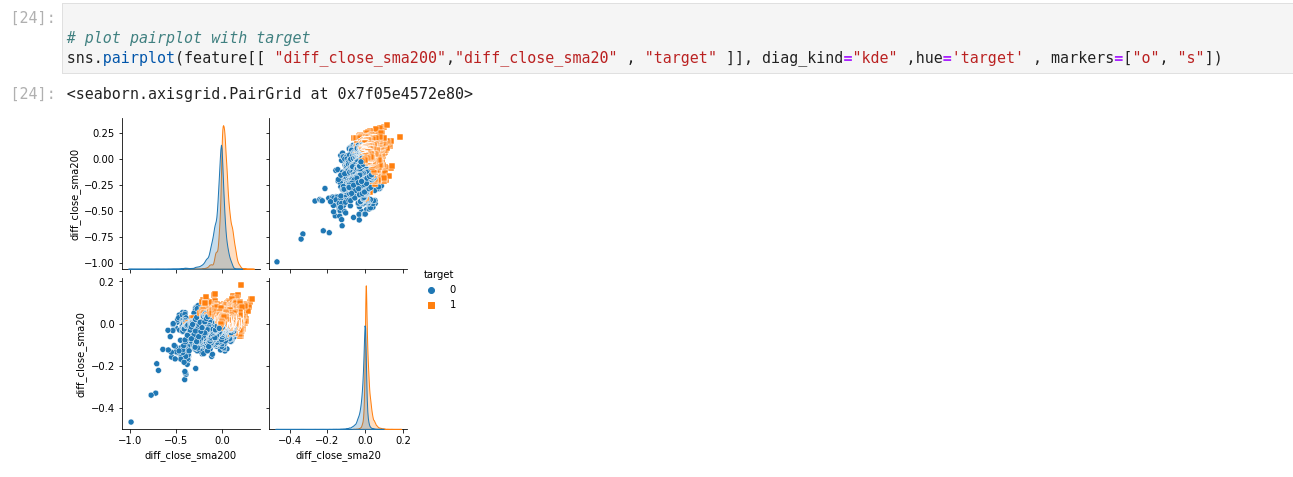
Next, define a labeling rule for practice: Close price > SMA50 → label 1, else 0. Use Seaborn’s pairplot to visualize how features cover this target.
In the next article, we’ll implement these labels and features in training and backtesting to improve our algo’s win rate.